
Why spreadsheets still matter for crypto tracking

Most beginners jump straight to the first shiny crypto portfolio tracker they find, then get frustrated when numbers don’t match exchange balances or on‑chain wallets. Spreadsheets look boring by comparison, yet they give something apps rarely do: full transparency and control. Every formula is visible, every column is your decision, and no hidden logic decides your PnL. Think of a spreadsheet as your “flight recorder”: even if an exchange disappears or an API breaks, your data and logic stay with you, and you can rebuild dashboards on top of that solid base.
Key terms you must understand before building anything
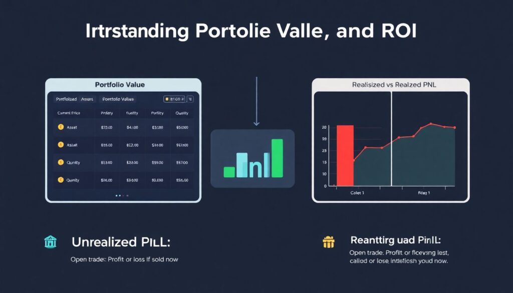
Before playing with charts, it helps to pin down a few concepts. “Portfolio value” is simply the sum of current price × quantity for each asset. “Unrealized PnL” is profit or loss you would have if you sold now, while “realized PnL” comes only from actual closed trades. “ROI” usually means total profit divided by invested capital, expressed in percent. “Cost basis” is what you originally paid per coin, including fees. Once you know what each term really means, you can decide which metrics matter and avoid the classic trap of mixing realized and unrealized results into one confusing number.
Spreadsheets vs apps: what’s really different
Specialized apps feel convenient, especially the one that markets itself as the best crypto portfolio tracking app, but you pay with rigidity. If the app shows “portfolio performance” in a way you dislike, you typically can’t fix the formula or logic behind it. A spreadsheet, on the other hand, is like an open lab: want to separate long‑term holds from degen trades, or stablecoin farming from NFTs? Just add flags and extra columns. Apps win on plug‑and‑play comfort and mobile UX; spreadsheets win when you care about auditability, custom metrics, or combining data from obscure chains and experimental DeFi positions.
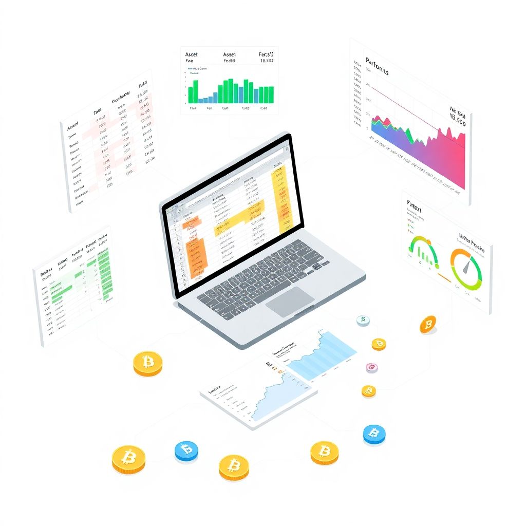
Basic architecture of a crypto spreadsheet setup
Picture a simple yet robust layout. First sheet: “Raw Data”, where every trade, deposit, withdrawal and fee is logged. Second sheet: “Mappings”, where you define asset categories, trading venues, and maybe risk levels. Third sheet: “Metrics”, where formulas calculate PnL, ROI, and exposures. Finally, a “Dashboard” sheet aggregates everything into charts and summary cards. This separation lets you experiment with formulas or new indicators without damaging the raw history. If an exchange export changes format, you only adjust the import area, while your visual layer and calculated metrics remain untouched.
Using Excel and Sheets: manual but powerful
A surprisingly effective approach for beginners is to track crypto investments in Excel using a very small but disciplined model. Columns might include date, asset, quantity, price in quote currency, fee, type of transaction, and source (exchange, wallet, DeFi protocol). Then you add calculated columns: position size, average cost, and current value fed from a price sheet. For prices, you can pull data via web queries or paste them daily to keep things simple. This doesn’t feel fancy, yet it gives a rock‑solid foundation that scales later into automation and more advanced dashboards when you are ready.
Designing a reusable spreadsheet template
If you hate repetition, build a flexible cryptocurrency portfolio spreadsheet template once and reuse it for new market cycles or test portfolios. Focus less on visual flair and more on structure: dynamic named ranges, consistent transaction types, and clean date formats. Add a configuration area where you can set your base currency, starting capital, and maybe risk thresholds for red/yellow/green signals. The trick is not to hardcode specific tickers or exchanges; instead, let the template accept any asset symbol and classify it through your mapping rules. That’s how one file can serve both spot traders and yield farmers.
Imaginary diagrams: how your data should look
Imagine a horizontal bar chart where each bar is a coin and its length shows portfolio percentage. Now flip perspective: a stacked area chart over time, layers representing categories like “Layer1”, “DeFi”, “Stablecoins”. Add a line overlay of total portfolio value. In a performance diagram, you might have three lines: portfolio equity curve, benchmark (say BTC), and cumulative net deposits. When your curve beats BTC while deposits stay flat, you’re actually outperforming the market. When equity grows only because deposits rise, the diagram exposes that you are just adding cash, not generating real returns.
Building a crypto portfolio dashboard from your sheet
A good crypto portfolio dashboard distills all that underlying data into fast, visual answers. You might show top five holdings by value, daily and monthly PnL, win rate on closed trades, and worst drawdown so far. A creative twist is to add a “mood gauge” linked to volatility: if 30‑day volatility crosses your threshold, the gauge turns red, nudging you to reduce leverage. With pivot charts or filters, you can drill down into one exchange, one strategy tag, or even a single token. The goal is to see at a glance whether today’s moves are noise or genuinely changing your long‑term picture.
Comparing dashboards to dedicated tracking apps
Most apps give you prebuilt charts and auto‑refresh prices, which feels effortless. Yet they rarely expose the raw formulas behind metrics like “time‑weighted return” or “Sharpe ratio”. With a custom crypto portfolio tracker built on your own data, you can verify each calculation and tweak it. Want to backtest how your portfolio would look if you had ignored meme coins or kept a fixed 20% in stablecoins? In a sheet‑based dashboard, you can simulate this with scenario filters. Apps shine for casual monitoring, but homemade dashboards win if you enjoy experimenting with ideas and running “what if” analyses.
Nonstandard tricks to make spreadsheets less boring
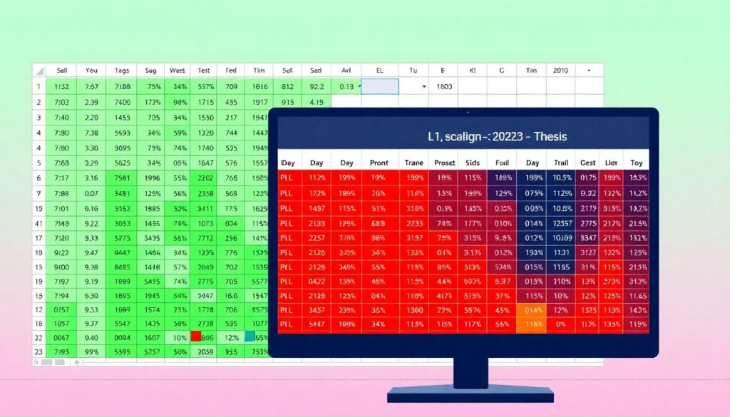
One underused hack is turning conditional formatting into a heatmap. Shade cells from green to red based on 7‑day or 30‑day PnL; suddenly your eyes jump straight to problem positions. Another twist: instead of only tracking coins, track “theses”. Assign each trade a thesis ID like “L1_scaling_2025” and monitor aggregate performance by idea, not just by asset. You can also import on‑chain data via APIs into Google Sheets, then compare realized PnL from CEX trades with staking rewards or airdrops. These little experiments transform a simple grid into an actual research lab rather than just a static ledger.
When and how to blend spreadsheets with apps
You don’t have to pick sides forever. Many people keep a lightweight app on their phone for quick checks and use spreadsheets for deep analysis. Let the app handle automatic price updates and basic balances, while the sheet handles messy edge cases like bridging losses, failed transactions or NFT flips. You can periodically export data from the app and merge it into your model, or the other way around. Over time, this hybrid approach evolves: maybe the app remains your mobile glance tool, while the spreadsheet becomes the “source of truth” that drives tax reports, strategy tweaks and long‑term decision making.