
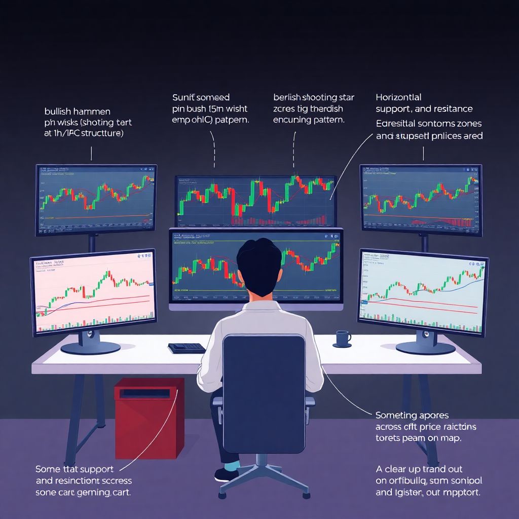
Why Chart Reading Matters More Than Hot Tips
If you trade crypto long enough, you’ll notice something: people who stare at charts calmly usually keep their money; people who stare at Twitter usually don’t.
You don’t need to be a math genius to read crypto charts. You just need a clear framework. In this guide we’ll go step by step through candlesticks, indicators, and market structure — with a focus on how to actually use all this in real trades, not just memorize theory like in a dry crypto trading course for beginners.
—
The Basics: What You’re Actually Looking At
Price, Timeframe, Volume — Three Core Pieces
At its core, any crypto chart shows three things:
1. Price – How much one unit of the coin costs in your quote currency (e.g., BTC/USDT).
2. Timeframe – The time each candle or bar represents (1m, 5m, 1h, 4h, 1d, etc.).
3. Volume – How many coins were traded in that period.
Imagine a simple diagram in your head:
– Along the bottom (horizontal axis) — time.
– Along the side (vertical axis) — price.
– Under the price chart — vertical bars for volume; taller bar = more trading that period.
For short‑term trades, you mostly live on 5m, 15m, and 1h charts.
For swing trades, you’ll look at 4h and 1d.
Think of timeframes like zoom levels in Google Maps: zoomed in (1m–5m) shows tiny streets, zoomed out (1d–1w) shows continents. You need to know which “map” you’re using before planning a “route.”
—
Candlesticks: Reading One Candle Like a Story
What a Single Candlestick Really Tells You
A candlestick is just a visual way to show open, high, low, close (OHLC) for a given time period.
Picture a vertical line with a box in the middle:
– The box (body):
– Top of body = close (if bullish/green) or open (if bearish/red).
– Bottom of body = open (if bullish) or close (if bearish).
– The thin lines (wicks or shadows):
– Top wick = highest price reached.
– Bottom wick = lowest price reached.
In words, our “diagram” looks like this:
> A rectangle (the body) standing on a thin line (the lower wick) with another thin line on top (upper wick). The body is green when price closed higher than it opened, and red when it closed lower.
Translation into trader language:
– Long lower wick = buyers stepped in and rejected lower prices.
– Long upper wick = sellers stepped in and rejected higher prices.
– Big fat body = strong move in one direction.
– Tiny body, big wicks = indecision, tug-of-war.
Key Single-Candle Signals (You’ll Actually Use)
You don’t need to memorize 30 names. Start with a few that matter most in any candlestick patterns crypto trading strategy:
1. Pin bar / hammer (bullish)
– Small body near the top, long lower wick.
– Shows sellers pushed price down, buyers smashed it back up.
– Works best after a downtrend, near support.
2. Shooting star (bearish)
– Small body near the bottom, long upper wick.
– Shows buyers pushed price up, sellers slammed it down.
– Works best after an uptrend, near resistance.
3. Engulfing candle
– A candle whose body fully covers the body of the previous one.
– Bullish engulfing: red candle, then a larger green candle that engulfs it.
– Bearish engulfing: green candle, then a larger red one.
Practical rule:
A single candle is not a trade signal by itself. It’s a clue. Combine it with support/resistance and trend direction.
—
Reading Multi-Candle Patterns Without Memorizing Names
Pattern Logic in Simple Terms
Forget the textbook for a moment. Think in terms of:
– “Are buyers gaining or losing control?”
– “Is this move accelerating or stalling?”
For example:
– Three strong green candles, each closing near the high → aggression by buyers.
– Alternating green/red with small bodies and long wicks → no one’s in control, likely a range.
You don’t need to recall whether it’s “Morning Star” or “Evening Star” to make money. You need to understand shift in momentum.
—
Support and Resistance: The Skeleton of Market Structure
Clear Definitions
– Support – A price area where buyers previously stepped in strongly enough to stop a fall and reverse it upward.
– Resistance – A price area where sellers previously stepped in strongly enough to stop a rise and reverse it downward.
Look at a chart and imagine a simple sketch:
> You draw horizontal lines where multiple candles stopped falling and bounced up (support) and where multiple candles stopped rising and fell (resistance). The more touches, the stronger the level.
These levels form the backbone of market structure. Without them, you’re just guessing.
How to Draw Practical Levels (Step by Step)
1. Zoom out to the 4h or 1d chart.
2. Mark zones where price:
– Reversed direction several times.
– Consolidated (moved sideways) before a big move.
3. Treat them as zones, not perfect lines; price often pierces them a bit.
When you later go down to the 15m or 5m chart to figure out how to read crypto charts for day trading, these higher‑timeframe levels become your “walls” and “floors.” You look for trades around them, not randomly in the middle of nowhere.
—
Trends, Ranges, and Breakouts
Identifying the Trend Like an Adult, Not a Hopeful Gambler
Trend definition that actually helps:
– Uptrend: price makes higher highs (HH) and higher lows (HL).
– Downtrend: price makes lower highs (LH) and lower lows (LL).
– Range: highs and lows are roughly horizontal; no clear progress.
To visualize:
> In an uptrend “diagram,” if you connect the swing lows with a line, it slopes up; connect swing highs, also slopes up. In a range, both lines are almost flat, forming a box.
Practically:
– In uptrends, you mainly look for buys on pullbacks.
– In downtrends, you mainly look for sells on pullbacks.
– In ranges, you buy near support and sell near resistance, or you just wait.
Breakouts vs Fakeouts
A breakout is when price leaves a range or breaks a strong support/resistance level with power.
Clues of a real breakout:
– Strong candle closing outside the range.
– Above-average volume.
– Little to no immediate reversal.
Clues of a fakeout:
– Wick pokes above/below the level, but the candle closes back inside.
– Volume isn’t really different.
– Next candles move back into the range.
Your job is not to guess the next tick; your job is to wait until the market clearly shows its hand.
—
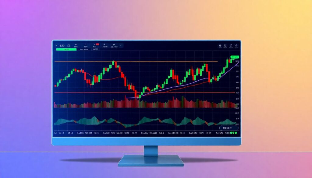
Indicators: Tools, Not Magic Spells
What Indicators Actually Are
Indicators are just math applied to past price and volume. They do not predict the future; they help you interpret current conditions.
In a typical crypto technical analysis for beginners, you’ll be bombarded with acronyms. Let’s cut to those you’ll really use:
– Moving Averages (MA) – Show the average price over X periods.
– RSI (Relative Strength Index) – Measures the speed and size of recent moves; often used for “overbought/oversold.”
– MACD (Moving Average Convergence Divergence) – Compares two moving averages to show momentum shifts.
– Volume indicators – Help you see when big money may be active.
Moving Averages: Dynamic Support and Resistance
Say you add a 50-period EMA (Exponential Moving Average) on the 1h chart.
Diagram in words:
> A smooth curving line running through the middle of the candles. When price is above it and the line is sloping up, the trend is bullish. When price is below it and the line is sloping down, the trend is bearish.
Practical uses:
– In an uptrend, waiting for pullbacks to the 50 EMA can give safer entries.
– The MA often acts like a “magnet + trampoline” — price moves away, snaps back, and then bounces.
RSI: Don’t Use It Like a Beginner
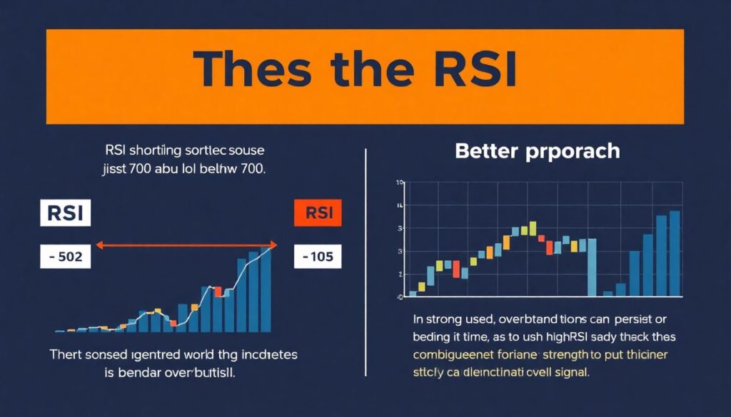
RSI ranges from 0 to 100. Above 70 is often called “overbought,” below 30 “oversold.”
New traders make a classic mistake:
– They short just because RSI > 70.
– They buy just because RSI < 30.
Better approach:
– In a strong uptrend, overbought can stay overbought for a long time. Use high RSI as confirmation of strength, not a sell trigger.
– Look for divergence:
– Price makes a higher high, RSI makes a lower high → momentum weakening.
– Price makes a lower low, RSI makes a higher low → selling pressure weakening.
Combining Indicators: Less Is More
When people talk about the best crypto trading signals and indicators, they often spam their charts with ten tools. That usually creates confusion, not clarity.
A simple, practical setup:
1. Price action + support/resistance (primary).
2. One trend filter (e.g., 50 EMA).
3. One momentum tool (e.g., RSI or MACD).
This is enough to build a structured approach without drowning in noise.
—
Building a Simple Candlestick + Structure Strategy
The Core Idea
You want your trades to align with:
– The trend on a higher timeframe.
– A key level (support or resistance).
– A clear price pattern (candlestick cluster, engulfing, pin bar).
– Optional confirmation from 1–2 indicators.
Here’s a step-by-step outline of a practical candlestick patterns crypto trading strategy for a beginner:
1. Define the bigger picture.
– Open the 4h or 1d chart.
– Mark main support and resistance zones.
– Decide: uptrend, downtrend, or range?
2. Drop to your trading timeframe.
– For day trading, use 15m or 5m.
– Always know where your price is relative to your higher‑timeframe levels.
3. Wait for price to tap a key level.
– In an uptrend, focus on pullbacks to support or to a rising MA.
– In a downtrend, focus on bounces to resistance or to a falling MA.
4. Look for a candlestick “story.”
– At support in uptrend: hammer, bullish engulfing, or series of higher lows.
– At resistance in downtrend: shooting star, bearish engulfing, or series of lower highs.
5. Check indicator confirmation (optional).
– Trend in your direction (price above/below MA).
– RSI not screaming against you (e.g., not massively overbought if you plan to buy).
6. Plan entry, stop loss, and target BEFORE clicking buy/sell.
– Stop loss: beyond the level you’re trading from (below support for buys, above resistance for sells).
– Target: at least 1.5–2x your stop distance.
7. Take the trade only if the plan makes sense.
– If target is tiny and stop is huge → skip.
– If the candle pattern is weak or level is messy → skip.
—
Example Trade: Turning Theory into Action
Scenario: Buying a Pullback in an Uptrend
Imagine BTC is in a clear uptrend on the 4h chart: higher highs, higher lows, and a 50 EMA sloping up. Price pulls back to a previously confirmed support zone and to the 50 EMA at the same time.
On the 15m chart you see:
– A fast drop into support.
– A hammer candle with a long lower wick (sellers tried to push lower, buyers rejected it).
– Next candle closes green, engulfing the hammer’s body.
– RSI was near 40 and turns up.
How you might execute:
1. Entry: After the bullish engulfing candle closes above the hammer’s high.
2. Stop loss: Below the wick of the hammer, outside the support zone.
3. Take profit: Near the previous swing high on 4h, giving you at least 2:1 reward:risk.
You didn’t enter because “it feels like it will bounce.” You entered because:
– Trend: Up on higher timeframe.
– Level: Strong confluence of support + EMA.
– Candle story: Rejection + confirmation.
– Indicator: RSI showing momentum tracking back in your direction.
That’s how you tie candlesticks, indicators, and market structure into one clean decision.
—
How to Read Crypto Charts for Day Trading Without Overwhelm
Tightening the Process
When you’re day trading, speed and clarity matter. You can’t spend 30 minutes philosophizing on each candle.
Use a minimal checklist like this before any trade:
1. What’s the trend on the 1h/4h?
2. Where are today’s key levels?
– Yesterday’s high/low.
– Overnight range.
– Major support/resistance from 4h.
3. Where is price now relative to those?
4. Is there a clear pattern (breakout, pullback, or range fade)?
5. Do candlesticks and 1–2 indicators support the idea?
If any answer is “I’m not sure,” consider not trading that setup. Zero trades is better than random trades.
—
Comparing This to “Signal Groups” and Auto-Indicators
Signal providers promise easy money: “Buy here, sell there.” But here’s the uncomfortable truth:
– If you don’t understand why the signal exists, you can’t manage it when it goes wrong.
– You’re blind if the market changes behavior and that “system” stops working.
Learning how to read charts yourself is slower in the beginning but far more powerful long term than following some “holy grail” bot.
Think of it this way:
– Signals = being spoon-fed.
– Chart reading = learning to cook.
Sooner or later, you’ll want independence.
—
Turning Knowledge into Habit: A Simple Practice Routine
Reading one article won’t make you a pro, the same way watching one video won’t make you a pilot. But you can speed up your progress with deliberate practice.
Try this 10–15 minute daily routine for a month:
1. Open the 4h chart of any major coin.
2. Mark trend direction and 2–3 key support/resistance zones.
3. Drop to 15m or 5m and:
– Circle places where price reacted to your levels.
– Note what candlesticks formed there.
– Check what your MA and RSI were doing.
Do this on historical charts first, as if you were living that day in real time. Ask:
– Would I have taken a trade here?
– Where would my stop and target have been?
– What did I miss?
This is essentially what a good crypto trading course for beginners should force you to do: repeat these analyses until they become second nature. You’re training your eye to recognize recurring structures, not just memorizing definitions.
—
Final Thoughts: Keep It Simple, Keep It Honest
You now have a practical framework to approach crypto technical analysis for beginners:
– Candlesticks tell a story about who’s in control right now.
– Market structure (trend, support, resistance) shows the bigger map.
– Indicators add context but shouldn’t overrule clear price action.
If you consistently:
1. Start from higher timeframes.
2. Respect support/resistance and trend.
3. Wait for clear candlestick confirmation at meaningful levels.
4. Use indicators as a secondary filter, not a crutch.
5. Define your risk and reward before every trade.
…you’ll be miles ahead of most retail traders who still chase pumps and panic on every red candle.
The charts aren’t mysterious. They’re just a record of human behavior. Learn to read that behavior, and you don’t need predictions — you just need probabilities and discipline.