

Why risk-adjusted metrics matter for crypto portfolios
If you’ve held a bag of altcoins through a wild bull run, you already know that raw returns can look amazing while your nerves are completely wrecked. That’s exactly why investors talk about crypto portfolio risk adjusted returns instead of just “I made 200% this year”. Risk‑adjusted metrics help you figure out whether those profits came from skill, a sensible strategy, or just reckless exposure to volatility. In a market where coins can pump 50% in a day and then dump just as fast, ignoring risk is basically the same as driving a race car with no brakes and hoping for the best.
Key risk-adjusted performance metrics in crypto
Sharpe ratio: the classic starting point
The Sharpe ratio is the usual first stop when people search for the best risk adjusted performance metrics for crypto. In simple terms, it tells you how much excess return your portfolio generated per unit of volatility, relative to a “risk‑free” asset like short‑term government bonds or a stablecoin yield proxy. In practice for crypto, you’d take your portfolio’s average return, subtract a risk‑free rate (maybe 3–5% annualized), and divide by the standard deviation of returns. A higher Sharpe ratio means you’re getting more reward for each bit of bumpiness in your equity curve, which is exactly what you want in a sane, long‑term strategy.
Sortino ratio: punishing downside, not upside
Many crypto portfolios show huge upside spikes that distort standard deviation and make volatility look scarier than it really is. That’s where the Sortino ratio comes into play. Instead of punishing all volatility, it only counts downside deviation, meaning it focuses on the bad swings, not the good ones. For traders who love trend‑following or momentum strategies on BTC and ETH, the Sortino ratio can be a better lens because it distinguishes between healthy upside noise and actual painful drawdowns. In a market where coins moon overnight, using Sortino keeps you from mislabeling explosive wins as “risk”.
Max drawdown and recovery time
Numbers like Sharpe and Sortino are handy, but they hide one gut‑punching detail: how bad did it feel at the bottom? Max drawdown shows the worst peak‑to‑trough drop your portfolio experienced over a given period. For example, if your portfolio went from $10,000 to $5,000 and later recovered, that’s a 50% drawdown. Add recovery time—how long it took to get back to the high—and you get a powerful, intuitive sense of risk. Many crypto investors discover the hard way that a strategy with amazing returns but brutal 70–80% drawdowns is almost impossible to stick with emotionally, even if the math says it’s profitable.
Other useful ratios and metrics
Beyond the big three, traders often use the Calmar ratio (return divided by max drawdown) and Omega ratio (weighing all returns above and below a target threshold). These might sound fancy, but at heart they’re doing the same thing: comparing what you gain versus what you suffer. When you explore how to measure crypto portfolio risk and return, you’ll find that no single metric tells the whole story. The real edge comes from combining them and asking, “Does this picture match what I actually experienced in real time, or is something off?” That sanity check is where many retail traders skip ahead and then regret it.
Necessary tools before you start
Data sources and portfolio tracking
To calculate any meaningful crypto portfolio risk adjusted returns, you need clean, consistent data. That means historical prices (ideally at daily or hourly resolution) and a clear record of your trades or allocations. You can pull prices from exchanges using APIs, grab CSV downloads from portfolio trackers, or rely on analytics platforms that already store OHLCV data. The main thing is to avoid mixing time zones, missing candles, or ignoring fees. Even small data glitches can warp volatility and drawdown stats, which then makes your risk measures look better or worse than they really are.
Analytics platforms and spreadsheets
You don’t need a PhD in quant finance to run crypto portfolio optimization Sharpe ratio calculations. Many people start in Google Sheets or Excel with basic formulas: average returns, standard deviation, and some simple ratio math. More advanced users plug into Python with libraries like pandas and numpy, or use specialized tools that support automated performance tracking. The key is consistency: choose a platform you’re comfortable maintaining. A half‑broken spreadsheet that you update “when you remember” is worse than a simple, reliable setup you actually look at every week and trust when making allocation decisions.
Risk and strategy documentation
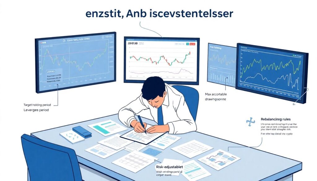
This part sounds boring, but it’s critical. Before you test risk‑adjusted metrics, write down your strategy and constraints: target holding period, leverage limits, maximum acceptable drawdown, and rebalancing rules. When you treat your crypto investment risk management strategies like a small business plan rather than a gambling binge, risk metrics suddenly become a feedback loop instead of trivia. Documenting your rules helps you compare “What I wanted this strategy to do” versus “What actually happened”, and that gap is where either improvements or brutally honest shutdown decisions are made.
Step-by-step process: from data to decisions
Step 1: Define your time frame and frequency
Before crunching numbers, decide what perspective you care about. Are you a swing trader looking at daily returns, or a long‑term investor focusing on weekly or monthly moves? If you day‑trade altcoin pairs, a daily Sharpe may hide a lot of intraday drama, while for a long‑only BTC/ETH basket, hourly data is overkill and just adds noise. Pick a frequency that matches how often you realistically adjust your portfolio. Then select a time window—for example, the last 12 months—to calculate your metrics so they reflect the regime your strategy actually experienced, not some ancient bull market.
Step 2: Calculate returns and volatility
Next, compute periodic returns: (current value – previous value) / previous value for each chosen interval. Once you have that series, calculate the average return and the standard deviation. This standard deviation is your core volatility input for most risk‑adjusted metrics. For Sortino, you’ll filter out the positive returns first and measure only the downside fluctuation. It’s worth double‑checking that your numbers line up with intuition: if your chart looks wild but your volatility comes out low, chances are you made a mistake with units, time scales, or skipped a big price move in your data.
Step 3: Apply Sharpe, Sortino and drawdown measures
Now plug the numbers into the formulas. For Sharpe, subtract the annualized risk‑free rate from your annualized return and divide by annualized volatility. For Sortino, you divide by downside deviation instead. Then compute max drawdown by scanning your equity curve for the largest peak‑to‑trough drop. Don’t just stare at the final numbers; compare them with your memory of actually holding the portfolio. If your Sharpe looks high but you remember several terrifying 50% drawdowns, either the period is too short, the data is off, or the metric isn’t capturing your real experience—as often happens when people cherry‑pick a bullish window.
Step 4: Compare portfolios and scenarios
Once you have metrics, the real power is comparison. You might look at your current portfolio versus a simpler benchmark like 50% BTC / 50% ETH, or versus a stablecoin yield strategy. If your complex basket of ten altcoins and DeFi tokens has a slightly higher return but much worse Sharpe, Sortino, and max drawdown than the benchmark, that’s a red flag. It means you’re taking on more stress and downside risk for a reward that doesn’t justify the chaos. This is also where you can test hypothetical allocations—like adding a bit of staked ETH—to see how they’d change your risk profile.
Step 5: Feed metrics into optimization, not worship them

The final step is using your numbers for adjustment, not blindly obeying them. You can run simple crypto portfolio optimization Sharpe ratio experiments by tweaking weights: increase allocation to assets that historically improved Sharpe without exploding drawdowns, and trim those that dragged it down. But remember that history is just one guide, not a guarantee. Combine quantitative outputs with qualitative insights: liquidity, regulatory risk, and your own sleep threshold. If a “mathematically optimal” allocation terrifies you in practice, it’s not actually optimal, because you’ll probably panic‑sell at the worst possible moment.
Typical beginner mistakes with risk-adjusted metrics
Focusing only on returns and ignoring risk
Many newcomers chase screenshots of 10x pumps and forget that those portfolios often spent months underwater. A classic beginner error is boasting about annual returns while hiding monstrous drawdowns. When they finally look at their risk numbers, they realize they survived several 60–80% equity crashes, which were basically coin flips away from total ruin. If you don’t measure these drawdowns and volatility, you’re flying blind, and no amount of lucky profit screenshots can replace a consistent, robust approach to how to measure crypto portfolio risk and return over different market cycles.
Using too short a backtest window
Another trap: calculating Sharpe or Sortino over a tiny slice of a bull run and thinking you’ve discovered a miracle strategy. Crypto regimes shift quickly; a DeFi yield farm that looked safe for six months might blow up overnight. If you only measure a small, favorable period, your risk‑adjusted metrics will be overly optimistic and completely miss how the system behaves in choppy or bearish conditions. A rule of thumb is to cover at least one full market cycle segment—bull, chop, and some form of drawdown—so you see how the strategy behaves when nothing is going your way.
Overfitting strategies to past ratios

Once beginners discover Sharpe and Sortino, they often start tweaking parameters just to maximize those ratios on historical data. That’s how you end up with absurd systems that look flawless on paper but implode the moment real markets shift. This overfitting problem is especially nasty in crypto because price series are noisy and heavily influenced by single events. If your shiny “optimized” strategy only works under a narrow set of past conditions, it’s not a strategy—it’s a fragile guess. Long story short: risk‑adjusted metrics are tools for evaluation, not trophies you optimize to at any cost.
Ignoring fees, slippage and funding
Beginners also tend to pretend that friction costs don’t exist. If you calculate risk‑adjusted performance using raw exchange prices but trade frequently, you’re forgetting trading fees, spreads, slippage, and, on derivatives, funding rates. All of these quietly eat returns and often increase effective volatility because you’re forced to trade more to maintain the same exposure. For high‑turnover systems, you should adjust your return series after deducting realistic costs. Otherwise, your Sharpe looks healthy, but in reality you’re bleeding slowly. Over a year, this gap can mean the difference between a promising strategy and one that just churns capital.
Not aligning metrics with personal risk tolerance
One more subtle mistake: chasing high Sharpe or Sortino scores that don’t match your psychology. Some people can handle 30–40% drawdowns without losing sleep; others start sweating at 15%. If your metrics tell you that a strategy is “great” but you consistently break your own rules during drawdowns, it’s not actually great for you. The whole point of crypto investment risk management strategies is to build something you can execute consistently. That means accepting slightly lower returns or a less “perfect” Sharpe if it gives you a smoother, more emotionally sustainable ride through volatile markets.
Troubleshooting: when the numbers don’t make sense
Metrics jump around wildly between runs
If every time you recalculate your metrics, your Sharpe and Sortino ratios look completely different, something is off. First, check that you’re using the same time frame and frequency each time—mixing daily and hourly data or changing start dates can cause huge swings. Second, inspect your price series for missing data or sudden zero candles, which slash or inflate volatility. Finally, confirm you’re annualizing returns and volatility consistently. Once that’s stable, any remaining shifts probably reflect real market regime changes, which is a signal to reassess your strategy, not just your spreadsheet formulas.
Sharpe looks great, but drawdowns feel unbearable
Sometimes your Sharpe ratio is decent, yet your lived experience is “this portfolio is killing me”. This usually means your metrics are hiding path dependency: the sequence of wins and losses matters more than the averages. A strategy that grinds sideways and then spikes up can show similar Sharpe to one that swings violently all year, even though they feel nothing alike. In that case, lean more on max drawdown, Sortino, and even daily PnL distributions. If the path looks like a roller coaster, don’t let a respectable Sharpe talk you into holding something you can’t emotionally handle.
Different platforms show different ratios
It’s common to compare risk‑adjusted metrics from an exchange report, a third‑party analytics site, and your own spreadsheet—and see three different answers. This doesn’t automatically mean anyone is lying; they might just be using different assumptions: varying risk‑free rates, compounding methods, or data windows. To troubleshoot, align parameters as closely as possible, then drill into basic stats like average return and volatility. If those match, the small differences are just methodology. If they don’t, figure out which data source is missing trades, mis‑pricing assets, or skipping periods when markets were closed or illiquid.
Nothing improves despite “optimization”
If you keep tweaking allocations, adding exotic coins, or changing rebalancing rules and your risk‑adjusted performance barely improves—or even declines—that’s a sign you might be fighting noise. At some point, additional complexity stops paying off. Troubleshooting here means stepping back and asking whether a simpler benchmark (like a BTC/ETH mix plus stablecoin yield) already offers solid risk‑adjusted returns. Remember: optimization should produce a portfolio that’s easier, not harder, to understand and maintain. If your system becomes so complex you can’t explain it on a whiteboard, you’ve probably wandered away from practical, robust investing.
Bringing it all together
Risk‑adjusted performance metrics won’t magically predict the next bull run, but they will keep you honest about what you’re really earning per unit of stress. When you combine Sharpe, Sortino, drawdowns and a bit of common sense, you can compare strategies, avoid obvious traps, and fine‑tune your allocations instead of trading purely on vibes. In an asset class as chaotic as crypto, that edge is huge. Treat your portfolio like a small quant lab: gather clean data, run simple but consistent calculations, and actually act on what the numbers tell you, even when they contradict the hype on your Twitter feed.