

Why on-chain analytics matter in 2025
On‑chain analytics sounds fancy, but at its core it simply means: reading what actually happens on a blockchain and turning it into something humans can understand. Instead of trusting rumors, tweets or exchange screenshots, you look directly at the ledger: who is sending what, when, and how it flows between wallets, protocols and exchanges. In 2025 this has become a critical skill, because markets move faster, liquidity is more fragmented, and big players leave clear footprints on‑chain long before news headlines catch up.
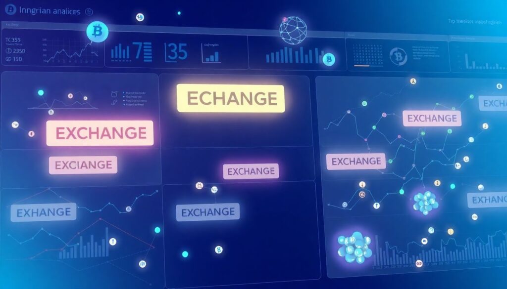
As blockchains matured, raw data volumes exploded, so dashboards and visualization layers became essential. You rarely query nodes directly now; instead you use specialized interfaces that preprocess, label and aggregate transactions for you. That shift turned on‑chain analytics from a niche for hardcore data engineers into something accessible to retail traders, DeFi users and even NFT collectors. A beginner today can open a browser, connect a wallet, and see token flows, protocol health and risk indicators in minutes, without writing a single line of code or running their own infrastructure.
—
Historical background: from block explorers to full analytics
Early days: reading raw blocks
In Bitcoin’s first years, “analytics” mostly meant opening a block explorer and manually checking transactions. There were no labels, no wallet clustering, no notion of investor cohorts. You saw hashes, addresses and amounts, and you had to reconstruct narratives by hand. This limited what you could infer, but it established an important precedent: everything important is public, if you know where and how to look. That transparency later became the foundation for much more advanced behavioral and liquidity analysis across chains.
As Ethereum introduced smart contracts, complexity spiked. Suddenly there were token transfers, DEX trades, lending positions and NFT mints all encoded as contract calls and events. Early explorers were not built for this richness, so on‑chain analytics software for blockchain analysis emerged to decode logs, classify contract types and map relationships. Projects like DEX trackers and DeFi dashboards in 2018–2020 demonstrated that you could reconstruct entire markets and protocols solely from on‑chain traces, with no need to trust centralized data providers or opaque APIs that hide methodology and sampling issues.
2020–2024: institutionalization and dashboards
By the DeFi summer of 2020, the need for structured analytics became obvious. Yield farming, composable protocols and rapidly rotating liquidity meant “price charts only” were no longer enough. Institutions wanted risk metrics, regulators wanted monitoring, and retail traders wanted clear visual cues. This pushed the ecosystem toward full‑stack solutions and the best on-chain analytics platforms for crypto investors started to look like traditional market terminals, but powered by blockchain data instead of private exchange feeds.
From 2021 to 2024, the market consolidated: some providers focused on regulatory intelligence and AML, others on DeFi health, NFT markets or derivatives. Retail‑friendly interfaces improved dramatically, with prebuilt charts, wallet labeling and strategy templates. That period is what made today’s on-chain analytics tools for beginners feasible: most of the heavy lifting—data indexing, normalization, enrichment—happens behind the scenes, so a newcomer interacts with curated metrics and simplified dashboards rather than raw transaction logs, RPC calls or complex SQL queries.
—
Core principles of on-chain analytics
Transparency and verifiability
The first key principle is that blockchain data is transparent and verifiable. Every transaction, contract deployment, token mint or burn is recorded in a shared ledger that anyone can audit. On-chain analytics takes that immutable record and structures it into entities: wallets, protocols, bridges, exchanges. When a dashboard tells you “this address deposited 1,000 ETH into a lending protocol,” you can always follow the link back to the underlying transaction. This verifiability is what differentiates on‑chain metrics from opaque “whale alerts” or centralized exchange stats with unknown sampling.
At the same time, transparency does not automatically mean clarity. Addresses are pseudonymous, and many wallets belong to the same user or entity. Analytics pipelines therefore add a labeling and clustering layer: they group addresses by behavior, known tags, interaction patterns and off‑chain information. The goal is not to deanonymize individuals, but to map systemic behavior: exchanges, funds, market makers, smart contract deployers. When a dashboard marks an address as a market‑maker or bridge contract, that label often arises from a combination of heuristics and manual verification, which beginners should treat as probabilistic, not absolute.
From raw transactions to meaningful metrics
The second principle is abstraction. Raw blockchain events are too granular for most decisions, so on‑chain analytics tools aggregate them into higher‑level metrics. For example, a “TVL” chart sums token balances across many liquidity pools, converted into a base currency. A “holder distribution” view classifies wallets by size buckets or by age of coins. A “net exchange flow” metric subtracts withdrawals from deposits during a timeframe. Each layer of abstraction introduces assumptions, but also makes the data actionable. Knowing which assumptions a tool makes is crucial if you want to avoid misinterpreting trends.
Beginners often underestimate how many transformations sit between the raw chain and the final graph. Parsing logs, decoding ABI signatures, adjusting for token decimals, tracking rebasing mechanics, handling wrapped assets and bridges—all of this shapes the numbers you see. That’s why two platforms can show slightly different values for the same protocol. When evaluating metrics, it is useful to check whether a platform documents its methodology and whether you can drill down to transaction‑level data. Good dashboards expose both an overview and a path to the underlying evidence, not just pretty charts or high‑level percentages.
—
How dashboards package on-chain insights
What a modern crypto on-chain dashboard can show
A modern crypto on-chain dashboard for portfolio tracking typically combines three layers: your own wallet activity, protocol‑level data, and market‑wide flows. On the personal side, dashboards read your wallet addresses, identify your token holdings, open DeFi positions and NFT collections, and then track PnL, yield, fees and realized gains. On the protocol side, you might see liquidity depth, utilization rates, liquidation levels and governance activity. Market‑wide, you get exchange flows, stablecoin movements, bridge usage and network congestion indicators.
What makes these dashboards powerful is how they tie views together. If you hold a token, you can usually jump from your position to its liquidity pools, see who the biggest holders are, and study recent whale movements. If a protocol you use suddenly sees a spike in outflows, you can directly inspect which entities are leaving and whether this is just rotation or systemic stress. That integrated navigation—portfolio to protocol to network—lets beginners build intuition faster than trying to stitch insights from scattered explorers, order books and isolated analytics sites.
on-chain analytics tools for beginners: what to look for
When evaluating on-chain analytics tools for beginners, focus on three aspects: coverage, usability and explainability. Coverage means which chains, tokens and protocols are indexed, and how fresh the data is. Usability is about interface clarity, sensible defaults and the ability to save views or alerts without needing to understand every metric on day one. Explainability is often overlooked: good tools include metric descriptions, methodology notes, and examples of how a chart might be used for decisions, not just raw visualizations with cryptic labels.
Security and privacy also matter. Many dashboards ask you to connect a wallet; in most cases, read‑only access is sufficient and you should not need to sign arbitrary transactions. Check that a platform clearly states what data it stores, how it handles API keys, and whether you can use it in “view only” mode with just addresses. Over time, as your skills grow, you might outgrow simple dashboards and explore more advanced query interfaces. But starting with tools that feel intuitive and safe will reduce friction and make it easier to build consistent, data‑driven habits in your trading or investing workflow.
—
Practical examples and use cases
How to use on-chain data for crypto trading
To understand how to use on-chain data for crypto trading, imagine you are considering entering a new token that recently pumped. Price alone tells you it is strong; on‑chain data tells you whether it is sustainable. You can check whether the number of active wallets is rising, whether liquidity is deep enough to handle your order, and whether top holders are accumulating or distributing. If a small group of wallets controls most of the supply and has been steadily sending tokens to exchanges, that’s a very different story from broad distribution and rising long‑term holder balances.
Short‑term traders often watch exchange inflows and outflows as a sentiment proxy. Heavy inflows of a token to centralized exchanges can signal potential sell pressure, while outflows to self‑custody might suggest accumulation. Combining these flows with derivatives data and on‑chain stablecoin movements can refine entries and exits. For beginners, the key is not to chase every metric, but to pick a small set that clearly maps to decisions: “I buy only if holder concentration is improving and exchange inflows are low,” for example. Then you can systematically test and refine that rule rather than reacting to noise.
Portfolio and risk monitoring
On‑chain analytics shine for risk management, not just speculation. Dashboards can show how your portfolio is exposed by chain, sector and stablecoin type. If you hold multiple DeFi positions, a dashboard can surface liquidation thresholds, collateral composition and protocol dependencies. In 2025, cross‑chain bridges and restaking layers introduce hidden correlations: one protocol’s failure can ripple into several others. Analytics tools that visualize dependencies help you spot points of concentration that are not obvious from a simple token list.
Beginners often neglect historical behavior. Many dashboards let you replay protocol metrics around past stress events: liquidations, depegs, bridge hacks. Studying these episodes helps you understand which early warning signals tend to appear: spikes in borrow rates, sudden drops in pool TVL, abnormal bridge flows. Then you can set alerts for similar patterns. Over time, this transforms on‑chain analytics from a static “info source” into a dynamic risk radar that updates in near real time and supports both strategic allocation and tactical hedging decisions.
—
Choosing and combining platforms
best on-chain analytics platforms for crypto investors: selection criteria
The best on-chain analytics platforms for crypto investors in 2025 tend to specialize, even if they market themselves as all‑in‑one. Some excel at DeFi lending and derivatives, others at NFT markets, L2 ecosystems or cross‑chain flows. As a beginner, start by identifying your main use case: are you mostly a spot investor, a DeFi yield farmer, an NFT trader, or a cross‑chain arbitrageur? Then pick one generalist dashboard for broad market context and one or two niche platforms aligned with your specific strategies. This layered stack gives both breadth and depth without overwhelming you.
Cost and access model matter as well. Many platforms use a freemium approach: basic charts are free, advanced metrics and exports require a subscription. If you are just learning, free tiers and public community dashboards are usually sufficient. You can evaluate how consistently you rely on a platform before paying. It is also worth checking whether a platform allows API access or custom queries, even if you do not need them now; that flexibility becomes valuable as your skills grow or if you decide to automate parts of your workflow using scripts, bots or systematic rebalancing tools.
Combining dashboards with other data sources
On‑chain data is powerful but not omniscient. It does not encode off‑chain liabilities, private deals, or regulatory shifts. Effective investors combine dashboards with other sources: exchange order books, macro indicators, project documentation and governance forums. For example, if on‑chain metrics show rising activity on a protocol, you still need to check whether that activity is organic usage or a short‑lived incentive program that might vanish once emissions end. Reading proposals and community discussions helps interpret the sustainability of what you see on the charts.
In practice, many traders keep a “data routine”: a morning scan of key dashboards, followed by a quick read of major governance or news updates. Over time, you learn which on‑chain signals lead or lag price for different token types. L1s, L2s, DeFi primitives and meme coins all have distinct dynamics. Dashboards give you the raw signal; your job is to map it to each asset’s narrative and risk profile. That pattern recognition is where experience compounds, turning a beginner into a more systematic and disciplined market participant.
—
Common misconceptions and pitfalls
“Everything important is on-chain”
A frequent misconception is that everything that matters for a crypto asset is already reflected on‑chain. In reality, many critical factors are off‑chain: team competence, regulatory risk, treasury management, security practices. On‑chain analytics can hint at some of this—for instance, by showing whether a team wallet is dumping tokens—but it cannot replace full due diligence. Treat on‑chain data as one dimension in a multidimensional analysis, not the sole judge of a project’s quality, especially for early‑stage protocols or governance tokens with complex legal structures.
There is also a tendency to over‑interpret noise. A single large transfer, an unusual spike in gas fees, or a one‑off whale deposit can all look dramatic when visualized but may be routine in context. Good dashboards offer smoothing options and multiple timeframes to help you distinguish persistent trends from short anomalies. As a beginner, focus on patterns that persist across days or weeks and that align with plausible narratives, rather than building theses on a solitary transaction or a short‑lived spike in an obscure metric that no other data seems to confirm credibly.
Misreading labels and clusters
Another trap is taking labels as absolute truth. When a platform tags an address as an “exchange,” it is using a combination of heuristics, known deposit patterns and sometimes crowdsourced information. Most of the time this is accurate enough, but clusters can be wrong or outdated: entities change wallets, new services emerge, and a labeled address might be reused for a different purpose. If your whole thesis relies on one cluster—“fund X is buying this token”—it is worth double‑checking across multiple platforms or verifying via known deposit addresses.
Beginners should also be cautious with “whale” definitions. Some dashboards categorize whales by absolute token balance, but that can be misleading on illiquid or low‑cap tokens where even modest holdings count as large. More advanced views consider both relative ownership and behavioral history: is this address a smart money participant with a track record of profitable entries, or just a passive early buyer? Without this context, “whale tracking” can easily turn into noise‑following, where you chase stories about big wallets that may not actually be more informed than the broader market.
—
Getting started: a simple learning path
A realistic beginner workflow
A practical way to start is to pick one chain you already use—say Ethereum or a major L2—and one primary activity like holding blue‑chip tokens or using a few DeFi protocols. Connect a read‑only dashboard, import your addresses, and spend a week just observing: how does your portfolio value move relative to protocol TVL, active addresses and exchange flows? Note what seems correlated and what does not. This observational phase builds intuition before you attempt to design complex strategies or react aggressively to every metric.
Once you are comfortable, define two or three recurring questions you want dashboards to answer. Examples: “Is this token becoming more or less concentrated?”, “Is this protocol gaining or losing liquidity?”, “Are big holders sending coins to exchanges or to cold storage?” Then learn which specific charts and metrics answer each question. Save those views or pin them, and check them regularly. Over time, you will stop wandering aimlessly through dashboards and instead use them as targeted tools integrated into your normal research routine, trade planning and risk monitoring process.
From dashboards to deeper analysis
As your skills grow, you may want more control over queries. Many platforms expose SQL‑like interfaces or APIs, allowing you to build custom metrics or backtest hypotheses. At that point, you are moving beyond a pure UI and into the realm of building your own mini‑tooling on top of existing data infrastructure. This is where on-chain analytics software for blockchain analysis becomes a lever not just for consuming insights, but for generating proprietary views that few others are watching in the same structured manner.
You do not have to rush into coding, though. Even within visual dashboards, there is plenty of depth: custom filters, cohort definitions, chain comparisons, cross‑asset overlays. The main goal is to evolve from passive observer to active analyst—someone who can articulate why a metric matters, what assumptions it rests on, and how it should influence a concrete decision. In that sense, learning on‑chain analytics and dashboards in 2025 is less about mastering tools and more about developing a disciplined way of thinking about transparent data in inherently noisy and fast‑moving crypto markets.